How to Build Responsive Layouts with CSS

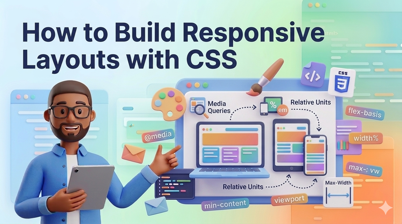
Today, people access websites from a wide variety of devices. Some users browse the internet on large desktop monitors, while others use laptops, tablets, or smartphones. Because screen sizes are so different, websites must be designed to adapt to multiple devices.
This is where responsive web design becomes important.
A responsive layout automatically adjusts its structure and content to fit different screen sizes. Instead of creating separate versions of a website for desktop and mobile devices, developers can use CSS techniques to make a single layout flexible and responsive.
Modern CSS provides powerful tools that make responsive design easier than ever. These tools include:
Flexible units
CSS Flexbox
CSS Grid
Media queries
By combining these technologies, developers can build websites that look good and function properly on any device.
In this guide, you will learn how to build responsive layouts using modern CSS techniques. The explanations are beginner-friendly and include practical examples you can try in your own projects.
Responsive web design is a design approach that allows a website to automatically adjust its layout based on the screen size of the user's device.
Instead of fixed layouts that only work on large screens, responsive layouts are flexible and adaptable.
For example:
On a desktop, a website may display three columns.
On a tablet, it may display two columns.
On a mobile phone, it may display one column.
This improves the user experience and ensures the content remains readable and accessible.
Responsive design is now considered a standard practice in modern web development.
One of the first steps in building responsive layouts is avoiding fixed pixel values whenever possible.
Instead of using px, developers often use flexible units such as:
percentages (%)
viewport units (vw, vh)
fractions (fr)
em and rem
Example:
.container {
    width: 90%;
    margin: 0 auto;
}
In this example, the container always takes 90% of the screen width, making it flexible across different devices.
Another useful unit is the viewport width.
Example:
.hero-title {
    font-size: 5vw;
}
This means the font size automatically scales based on the screen width.
Flexible units are an important foundation for responsive layouts.
Flexbox is one of the most popular tools for building responsive layouts.
It is designed for one-dimensional layouts, meaning it arranges items in rows or columns.
Example HTML:
<div class="flex-container">
    <div class="item">Item 1</div>
    <div class="item">Item 2</div>
    <div class="item">Item 3</div>
</div>
CSS:
.flex-container {
    display: flex;
    gap: 20px;
}

.item {
    flex: 1;
    padding: 20px;
    background: #ddd;
}
In this layout:
The container uses Flexbox
Each item automatically takes equal space
Flexbox also allows items to wrap when the screen becomes smaller.
Example:
.flex-container {
    display: flex;
    flex-wrap: wrap;
    gap: 20px;
}
This allows items to move to a new row when there is not enough space.
Flexbox is commonly used for:
navigation bars
card layouts
horizontal sections
menus
CSS Grid is another powerful layout system that works well for responsive designs.
Unlike Flexbox, CSS Grid is designed for two-dimensional layouts, meaning it handles rows and columns simultaneously.
Example HTML:
<div class="grid-layout">
    <div class="card">Card 1</div>
    <div class="card">Card 2</div>
    <div class="card">Card 3</div>
    <div class="card">Card 4</div>
</div>
CSS:
.grid-layout {
    display: grid;
    grid-template-columns: repeat(3, 1fr);
    gap: 20px;
}

.card {
    padding: 20px;
    background: #eee;
}
This creates a layout with three equal columns.
To make the grid responsive, we can use auto-fit and minmax.
Example:
.grid-layout {
    display: grid;
    grid-template-columns: repeat(auto-fit, minmax(250px, 1fr));
    gap: 20px;
}
This layout automatically adjusts the number of columns depending on the screen size.
For example:
large screens → more columns
small screens → fewer columns
This technique is widely used in modern responsive websites.
Media queries allow developers to apply different CSS styles depending on the screen size.
They are one of the most important tools in responsive design.
Example:
@media (max-width: 768px) {
    .container {
        padding: 10px;
    }
}
This means the styles inside the media query only apply when the screen width is 768px or smaller.
Example responsive grid adjustment:
.grid-layout {
    grid-template-columns: repeat(3, 1fr);
}

@media (max-width: 900px) {
    .grid-layout {
        grid-template-columns: repeat(2, 1fr);
    }
}

@media (max-width: 600px) {
    .grid-layout {
        grid-template-columns: 1fr;
    }
}
This layout changes based on screen size:
Desktop → 3 columns
Tablet → 2 columns
Mobile → 1 column
Media queries allow developers to fine-tune layouts for different devices.
Images must also adapt to different screen sizes.
A common technique is using:
img {
    max-width: 100%;
    height: auto;
}
This ensures that images never overflow their container and always scale proportionally.
Another useful feature is the picture element in HTML, which allows different images for different screen sizes.
<picture>
    <source media="(max-width: 600px)" srcset="small.jpg">
    <source media="(max-width: 1000px)" srcset="medium.jpg">
    <img src="large.jpg" alt="Responsive image">
</picture>
This helps improve performance on smaller devices.
Many developers follow a mobile-first approach when building responsive layouts.
This means designing the layout for small screens first and then expanding it for larger screens.
Example:
.container {
    padding: 10px;
}

@media (min-width: 768px) {
    .container {
        padding: 40px;
    }
}
Benefits of mobile-first design include:
better performance on mobile devices
simpler layouts
easier scalability
Mobile-first design is recommended by many modern web development guidelines.
Several layout patterns are commonly used in responsive design.
This layout is commonly used on mobile devices where content is stacked vertically.
Often used for content and sidebar layouts.
Popular for blogs, product listings, and galleries.
Example card grid:
.cards {
    display: grid;
    grid-template-columns: repeat(auto-fit, minmax(250px, 1fr));
    gap: 20px;
}
This pattern automatically adapts to different screen sizes.
Here are some useful tips for creating effective responsive designs.
Use flexible units instead of fixed widths whenever possible.
Test your layouts on multiple screen sizes.
Use browser developer tools to simulate mobile devices.
Keep layouts simple and avoid unnecessary complexity.
Combine Flexbox and Grid when appropriate.
Optimize images to improve loading performance.
By following these practices, you can create layouts that work well on any device.
Responsive web design is an essential skill for modern web developers. With the increasing number of mobile users, websites must be able to adapt to different screen sizes and devices.
In this guide, we explored several techniques for building responsive layouts using CSS. These included flexible units, Flexbox, CSS Grid, media queries, and responsive images.
Each of these tools plays an important role in creating layouts that are both flexible and user-friendly.
By practicing these techniques and experimenting with different layout structures, you can develop the skills needed to build professional and responsive websites.
As you continue learning web development, mastering responsive design will help you create better user experiences and build websites that perform well across all devices.
 Mar 07, 2026
Learn how CSS Grid works with simple explanations and practical examples. This b...
Odio ipsa voluptatem eos dolorem ut numquam. Ut sed voluptatum voluptatem repudi...
Et quis numquam mollitia et voluptatum et. Rerum consequatur qui consectetur off...
Placeat itaque iure a doloribus aut ipsa. Et et quod molestias ab.
Leave a Comment