CSS Grid Layout Beginner Guide

Creating layouts is one of the most important tasks in web development. Every website you visit is built using a layout system that organizes content such as headers, images, text, sidebars, and footers.
In the past, developers relied on techniques like floats, positioning, and tables to create layouts. While these methods worked, they were often complicated and difficult to maintain.
Modern CSS introduced two powerful layout systems to simplify this process:
Flexbox
CSS Grid
While Flexbox is excellent for arranging items in a single row or column, CSS Grid is designed for two-dimensional layouts, meaning it can handle both rows and columns at the same time.
CSS Grid allows developers to create complex layouts with very little code. It is flexible, powerful, and widely supported in modern browsers.
In this beginner-friendly guide, you will learn:
What CSS Grid is
How grid containers and grid items work
How to create rows and columns
How to control spacing and alignment
Practical examples of CSS Grid layouts
By the end of this article, you will have a solid understanding of CSS Grid and how to use it in your projects.
CSS Grid is a two-dimensional layout system used to organize content into rows and columns.
It works by defining a grid container that holds multiple grid items.
The container defines the structure of the layout, while the items fill the spaces inside the grid.
Example structure:
<div class="grid-container">
    <div class="grid-item">Item 1</div>
    <div class="grid-item">Item 2</div>
    <div class="grid-item">Item 3</div>
</div>
In this example:
The parent element is the grid container
The child elements are grid items
To activate CSS Grid, you simply set the container’s display property to grid.
To start using CSS Grid, you must first define a grid container.
Example:
.grid-container {
    display: grid;
}
Once this property is applied, all child elements automatically become grid items.
However, to see the layout clearly, we also need to define columns.
Example:
.grid-container {
    display: grid;
    grid-template-columns: 200px 200px 200px;
}
This creates three columns, each with a width of 200 pixels.
Example style for grid items:
.grid-item {
    background: #4CAF50;
    color: white;
    padding: 20px;
    border: 1px solid #fff;
}
Now the items will appear in a structured grid layout.
The most important part of CSS Grid is defining rows and columns.
Columns are created using the grid-template-columns property.
Example:
.grid-container {
    display: grid;
    grid-template-columns: 1fr 1fr 1fr;
}
The unit fr means fraction of available space.
This example creates three equal columns.
Another example:
grid-template-columns: 200px 1fr 1fr;This layout means:
First column: 200px
Second column: flexible
Third column: flexible
Rows can be defined using grid-template-rows.
Example:
.grid-container {
    display: grid;
    grid-template-rows: 100px 200px;
}
This creates two rows:
First row: 100px
Second row: 200px
Rows automatically expand if content becomes larger.
CSS Grid makes spacing very easy using the gap property.
Example:
.grid-container {
    display: grid;
    grid-template-columns: repeat(3, 1fr);
    gap: 20px;
}
This creates 20px space between rows and columns.
Before CSS Grid, developers often had to use margins to create spacing, which made layouts harder to maintain.
The gap property keeps layouts clean and organized.
CSS Grid provides a helpful function called repeat().
Instead of writing columns multiple times, you can simplify the code.
Example:
grid-template-columns: repeat(3, 1fr);This is equivalent to:
grid-template-columns: 1fr 1fr 1fr;Another example:
grid-template-columns: repeat(4, 200px);This creates four columns, each 200px wide.
The repeat() function makes grid layouts easier to read and maintain.
One powerful feature of CSS Grid is the ability to control where items appear.
Example:
.item1 {
    grid-column: 1 / 3;
}
This means the item spans from column 1 to column 3.
Example:
.item2 {
    grid-row: 1 / 3;
}
This makes the item span across multiple rows.
Example layout:
.grid-container {
    display: grid;
    grid-template-columns: repeat(3, 1fr);
}
This flexibility allows you to create complex layouts easily.
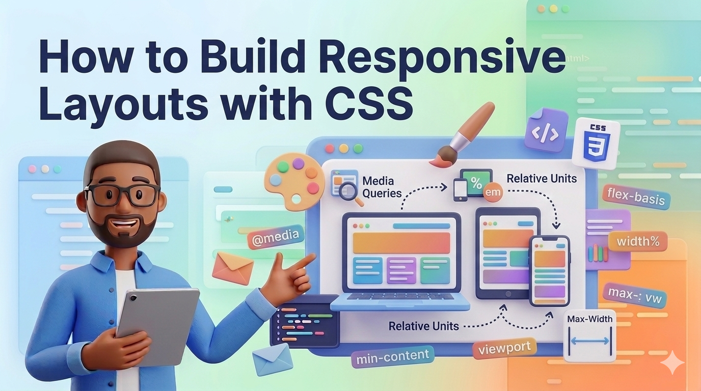
CSS Grid is excellent for responsive design.
Instead of manually adjusting layouts for different screen sizes, you can use flexible units.
Example:
.grid-container {
    display: grid;
    grid-template-columns: repeat(auto-fit, minmax(200px, 1fr));
    gap: 20px;
}
This layout automatically adjusts the number of columns depending on the screen size.
For example:
Large screens → more columns
Small screens → fewer columns
This makes responsive design much easier.
A common use case for CSS Grid is a blog layout.
Example HTML:
<div class="blog-grid">
    <div class="post">Post 1</div>
    <div class="post">Post 2</div>
    <div class="post">Post 3</div>
    <div class="post">Post 4</div>
</div>
CSS:
.blog-grid {
    display: grid;
    grid-template-columns: repeat(3, 1fr);
    gap: 30px;
}

.post {
    background: #eee;
    padding: 20px;
}
This creates a simple three-column blog layout.
You can easily adapt it for responsive screens.
Both CSS Grid and Flexbox are powerful layout tools, but they are designed for different purposes.
Flexbox is best for one-dimensional layouts, such as:
Navigation bars
Menus
Button groups
Toolbars
CSS Grid is best for two-dimensional layouts, such as:
Full page layouts
Image galleries
Dashboards
Blog grids
Many modern websites use both Grid and Flexbox together.
For example:
Grid for the page layout
Flexbox for components inside sections
Understanding both systems will make you a much stronger front-end developer.
If you are new to CSS Grid, here are some helpful tips:
Start with simple layouts.
Experiment with columns and rows.
Use browser developer tools to inspect the grid structure.
Practice building real layouts like galleries or dashboards.
CSS Grid becomes much easier once you practice using it regularly.
CSS Grid is one of the most powerful layout systems available in modern web development. It allows developers to create structured, responsive layouts using rows and columns with minimal code.
In this guide, we explored:
What CSS Grid is
How grid containers and items work
Creating rows and columns
Using spacing with gap
Building responsive layouts
Practical examples of CSS Grid
By learning CSS Grid, you can build cleaner layouts, write simpler CSS, and create responsive designs that work across all screen sizes.
As you continue learning web development, mastering CSS Grid will help you create modern and professional websites more efficiently.
Odio ipsa voluptatem eos dolorem ut numquam. Ut sed voluptatum voluptatem repudi...
Et quis numquam mollitia et voluptatum et. Rerum consequatur qui consectetur off...
Placeat itaque iure a doloribus aut ipsa. Et et quod molestias ab.
Est et recusandae tenetur. Voluptatem autem labore ipsum qui. Explicabo velit hi...
Leave a Comment