CSS Flexbox Layout Explained Simply

When building modern websites, arranging elements on a page is one of the most important tasks. In the past, developers often relied on floats, inline-block layouts, or complex positioning techniques to create page layouts. These methods worked, but they were often difficult to maintain and did not adapt well to different screen sizes.
To solve these problems, CSS introduced a powerful layout system called Flexbox, short for Flexible Box Layout.
Flexbox makes it much easier to align elements, distribute space, and create responsive layouts. Instead of struggling with complicated CSS tricks, developers can now build layouts with just a few simple properties.
In this beginner-friendly guide, you will learn:
What Flexbox is
How Flexbox works
Important Flexbox properties
How to align items easily
Practical examples of Flexbox layouts
By the end of this article, you will be able to create flexible and responsive layouts with confidence.
Flexbox is a one-dimensional layout system used to arrange items in a row or a column.
It is designed to:
Distribute space between items
Align items vertically and horizontally
Create flexible layouts that adapt to different screen sizes
Flexbox works using two main components:
1. Flex Container
The parent element that enables Flexbox.
2. Flex Items
The child elements inside the container.
When you apply Flexbox to a container, all its children automatically become flexible items.
Example structure:
<div class="container">
    <div class="item">Item 1</div>
    <div class="item">Item 2</div>
    <div class="item">Item 3</div>
</div>To activate Flexbox, simply set the container's display property to flex.
Example:
.container {
    display: flex;
}
Once this property is applied:
All child elements become flex items
Items will automatically align in a row
Example:
.container {
    display: flex;
}

.item {
    padding: 20px;
    background: #4CAF50;
    color: white;
    margin: 10px;
}
This simple rule already gives you a flexible layout.
The flex-direction property defines the direction of the layout.
By default, Flexbox arranges items horizontally.
.container {
    display: flex;
    flex-direction: row;
}
Possible values include:
row
Items are placed from left to right.
row-reverse
Items are placed from right to left.
column
Items are stacked vertically.
column-reverse
Items are stacked vertically but in reverse order.
Example:
.container {
    display: flex;
    flex-direction: column;
}
Common values include:
flex-start
Items align to the beginning.
center
Items align to the center.
flex-end
Items align to the end.
space-between
Equal space between items.
space-around
Equal space around items.
Example using space-between:
.container {
    display: flex;
    justify-content: space-between;
}
This spreads items across the container evenly.
Flexbox also makes vertical alignment very easy using align-items.
.container {
    display: flex;
    align-items: center;
}
Common values:
stretch
Items stretch to fill the container.
center
Items align vertically in the center.
flex-start
Items align to the top.
flex-end
Items align to the bottom.
Example:
.container {
    display: flex;
    height: 200px;
    align-items: center;
}
This will vertically center all items.
Sometimes items do not fit in one row. Flexbox allows items to wrap to the next line.
Example:
.container {
    display: flex;
    flex-wrap: wrap;
}
This allows elements to move onto multiple rows when necessary.
Example with responsive cards:
.container {
    display: flex;
    flex-wrap: wrap;
    gap: 20px;
}

.card {
    width: 200px;
    background: #eee;
    padding: 20px;
}
This is very useful when building responsive layouts.
Flexbox also allows items to grow or shrink depending on available space.
The flex property controls this behavior.
Example:
.item {
    flex: 1;
}
This means:
Each item will take equal space
Example:
.container {
    display: flex;
}

.item {
    flex: 1;
    padding: 20px;
}
Now all items will automatically resize.
You can also control growth:
.item1 {
    flex: 2;
}

.item2 {
    flex: 1;
}
Here:
Item1 takes twice as much space as Item2.
Flexbox is often used to create navigation bars.
HTML structure:
<nav class="navbar">
    <div>Logo</div>
    <ul>
        <li>Home</li>
        <li>Blog</li>
        <li>About</li>
        <li>Contact</li>
    </ul>
</nav>
CSS:
.navbar {
    display: flex;
    justify-content: space-between;
    align-items: center;
    padding: 15px;
    background: #333;
    color: white;
}

.navbar ul {
    display: flex;
    list-style: none;
    gap: 20px;
}
This simple layout already creates a clean navigation bar.
One of the most popular uses of Flexbox is perfect centering.
Example:
.container {
    display: flex;
    justify-content: center;
    align-items: center;
    height: 300px;
}
HTML:
<div class="container">
    <div class="box">Centered Content</div>
</div>
This centers content both horizontally and vertically.
Before Flexbox, this task required complex CSS tricks.
Before Flexbox, developers used:
Floats
Inline-block
Table layouts
These methods had several issues:
Float layouts required clearing elements.
Inline-block had spacing problems.
Table layouts were not designed for responsive design.
Flexbox solves these problems by providing:
Flexible alignment
Easy spacing control
Responsive behavior
Cleaner CSS
Because of these advantages, Flexbox has become one of the most commonly used layout systems in modern web development.
Flexbox works best when arranging items in one direction.
For example:
Navigation bars
Buttons
Cards in a row
Centering content
Menus
Toolbars
If you need a two-dimensional layout (rows and columns together), CSS Grid may be a better option.
However, for most everyday layouts, Flexbox is more than enough.
If you are just starting with Flexbox, keep these tips in mind:
Practice by building simple layouts.
Use browser developer tools to inspect layouts.
Experiment with different properties.
Combine Flexbox with responsive design techniques.
The more you practice, the more natural Flexbox will become.
CSS Flexbox is one of the most powerful tools available for modern web development. It allows developers to create flexible, responsive layouts with minimal code.
In this article, we covered:
What Flexbox is
How flex containers and items work
Important properties like flex-direction, justify-content, and align-items
Practical layout examples
Once you understand the basics, Flexbox becomes an essential part of your workflow when building websites.
As you continue learning CSS, you will find that Flexbox works perfectly alongside other layout tools like CSS Grid and media queries.
Mastering Flexbox will help you create cleaner code, better layouts, and more responsive websites.
 Mar 07, 2026
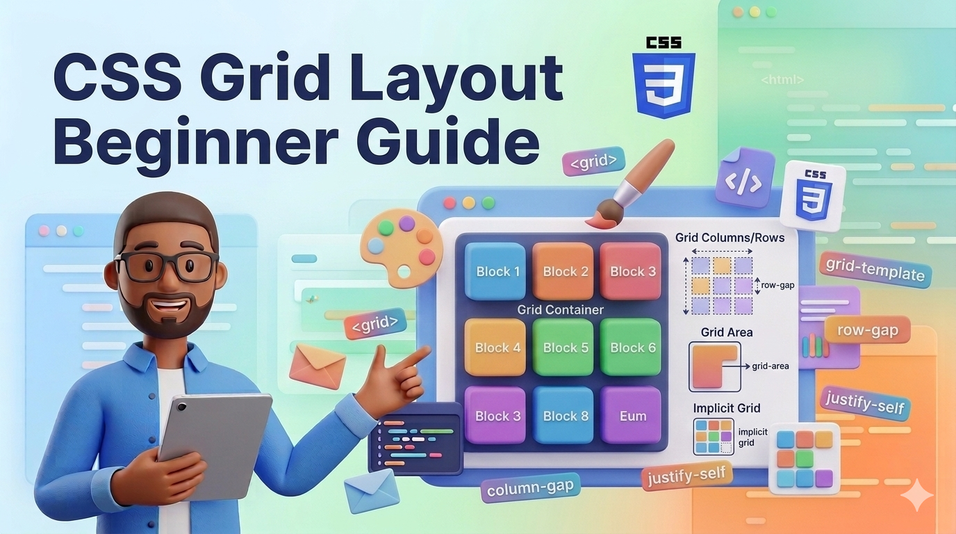
Learn how CSS Grid works with simple explanations and practical examples. This b...
Odio ipsa voluptatem eos dolorem ut numquam. Ut sed voluptatum voluptatem repudi...
Et quis numquam mollitia et voluptatum et. Rerum consequatur qui consectetur off...
Placeat itaque iure a doloribus aut ipsa. Et et quod molestias ab.
Leave a Comment